Pricing Structure Redesign - Improving Comparison Efficiency
Overhauling a cluttered web interface into a clear, desktop-optimized price comparison layout.
Client
Trip.com App & Web
Time
Oct 2022
My Role
Design Direction & Design
Team

Background & Issues
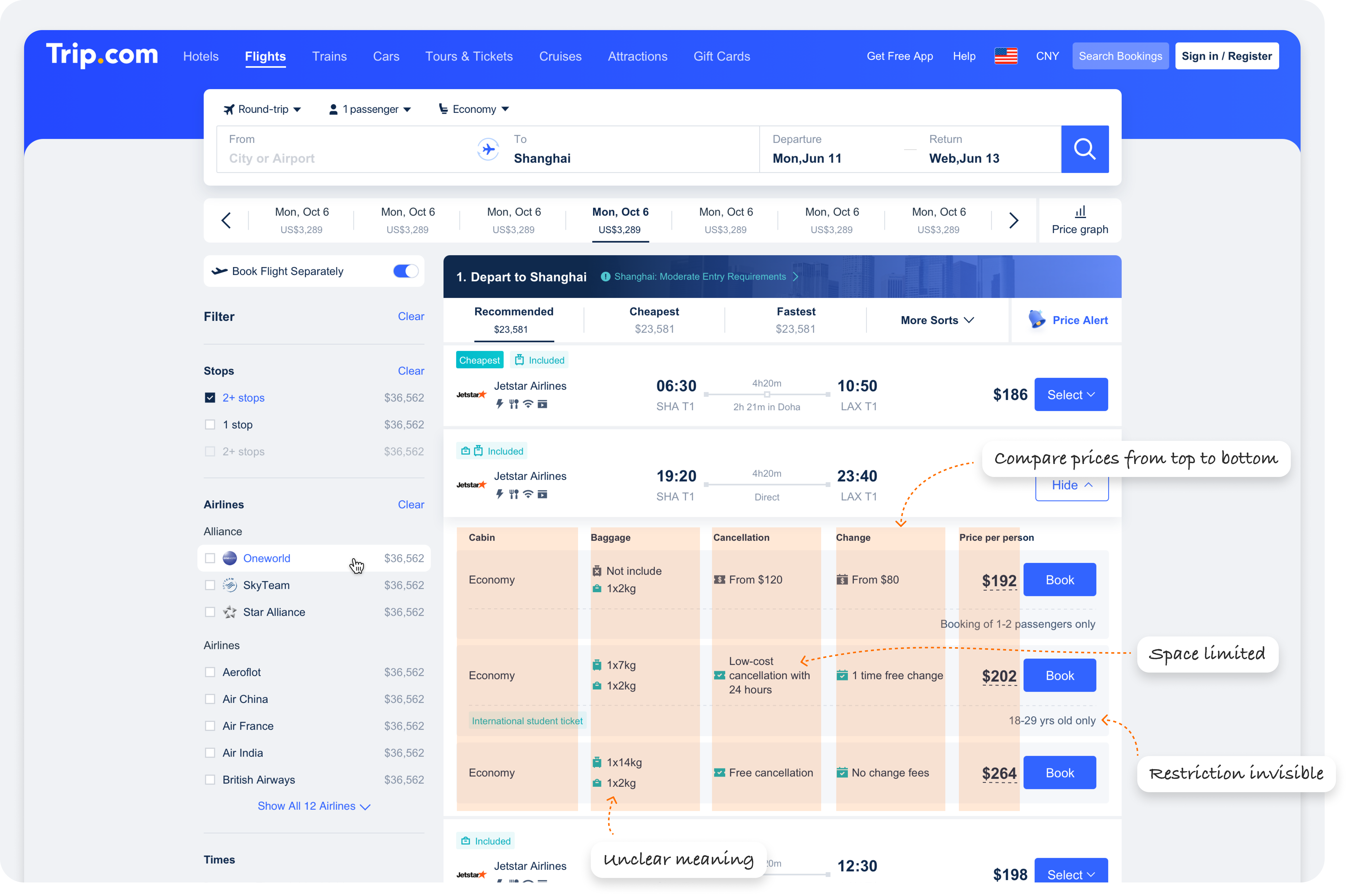
As shown in the image below, on Trip's flight search results page, we provide different pricing options based on baggage allowance and cancellation/change policies. However, the matrix layout, both horizontally and vertically, makes it difficult for customers to compare these policies, and the information display lacks flexibility.
Business Goal
Redesigned the information structure to make it easier to compare different prices, improve compatibility with multi-language displays, and ensure more precise and clear policy content.
My Impact
While this project might seem like just a redesign of the information structure, my role went beyond leading the design of the layout. I also had to rethink and redesign the meaning of all the icons and the accompanying copy. This required close collaboration with the product manager to pull content from the information database and establish guidelines for its use.
Design Overview
Key improvement: User Interface, Structure and Information, Color. (Will introduce the design process later)
Metrics
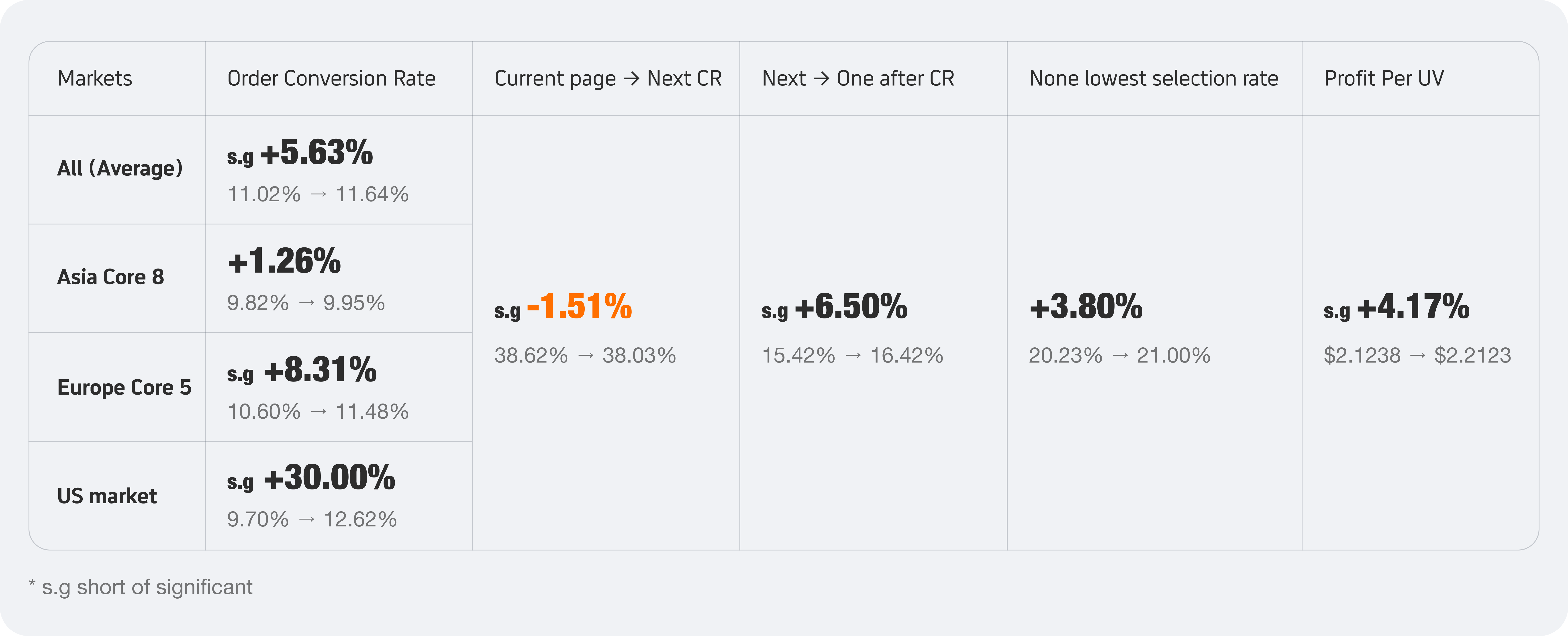
We validated the following data metrics through A/B testing:
Order Conversion Rate (Key Metric): Start from current page to complete payment, to verify whether design adjustments have a positive impact on order conversion. We monitored data from different markets, broadly categorized into the European market, the Asian market, and the American market.
Page Conversion Rate (Key Metric): We observed the conversion metrics of two p[ages, including the conversion from the current page to the next page and from the next page to the one after that. We considered the impact of the new design on page conversaions.
Non-Lowest Price Selection Rate (Reference Metric): Observed whether the new structural design achieves the goal of clear comparison, indirectly highlighting the advantage of the non-lowest price option.
Profit Per UV (Reference Metric): To verify whether the new design had a positive impact on order revenue.
Testing site: Global markets.
The following is the design process
Competitor Analysis
Study how competitors compare prices, analyze the differences with Trip, and identify areas for improvement. There are mainly two comparison methods:
1: Use a common category name on the left side
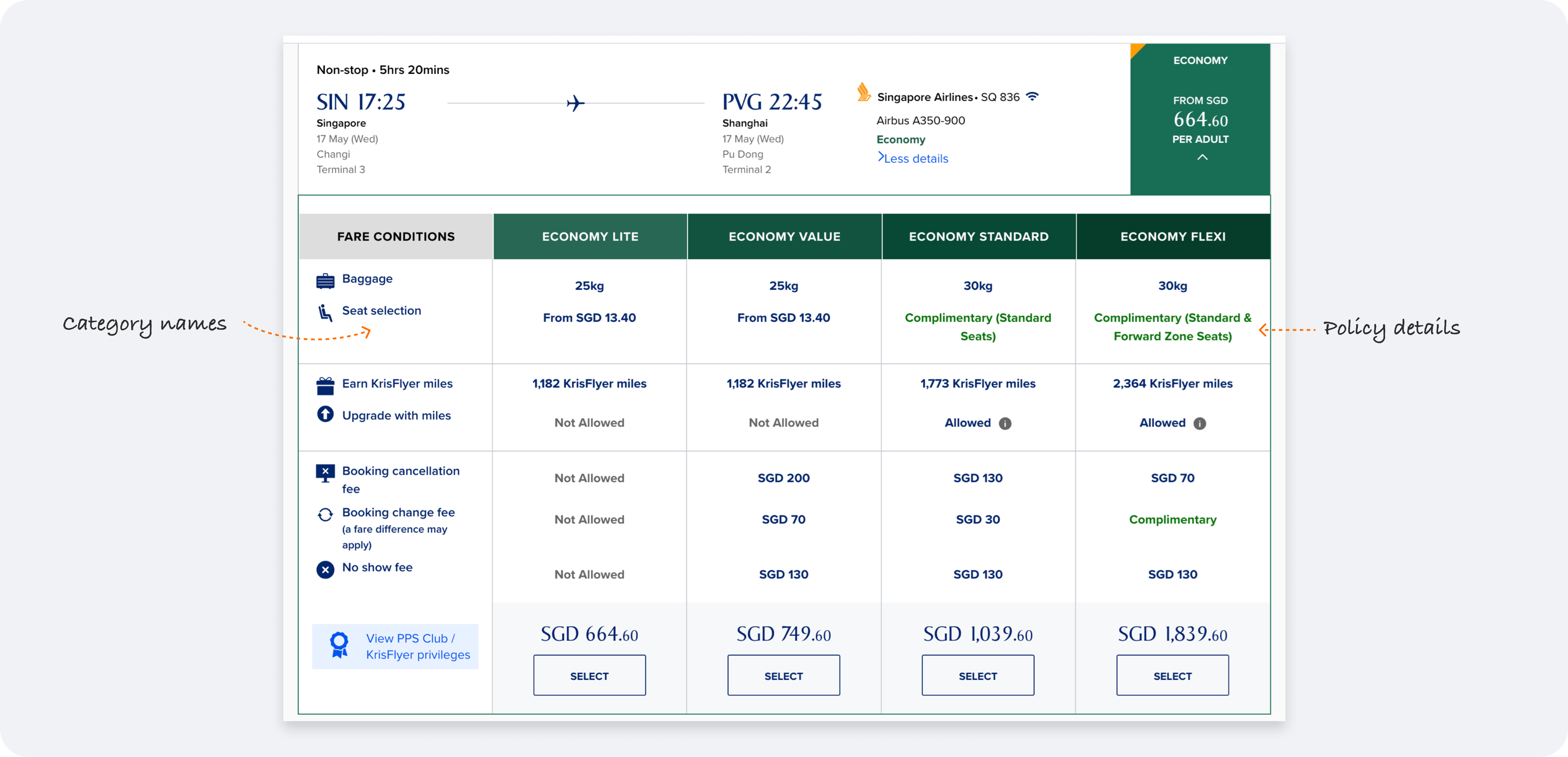
Trip currently uses this structure, which is neither very efficient nor clear in its comparisons.
2: Independent card structure
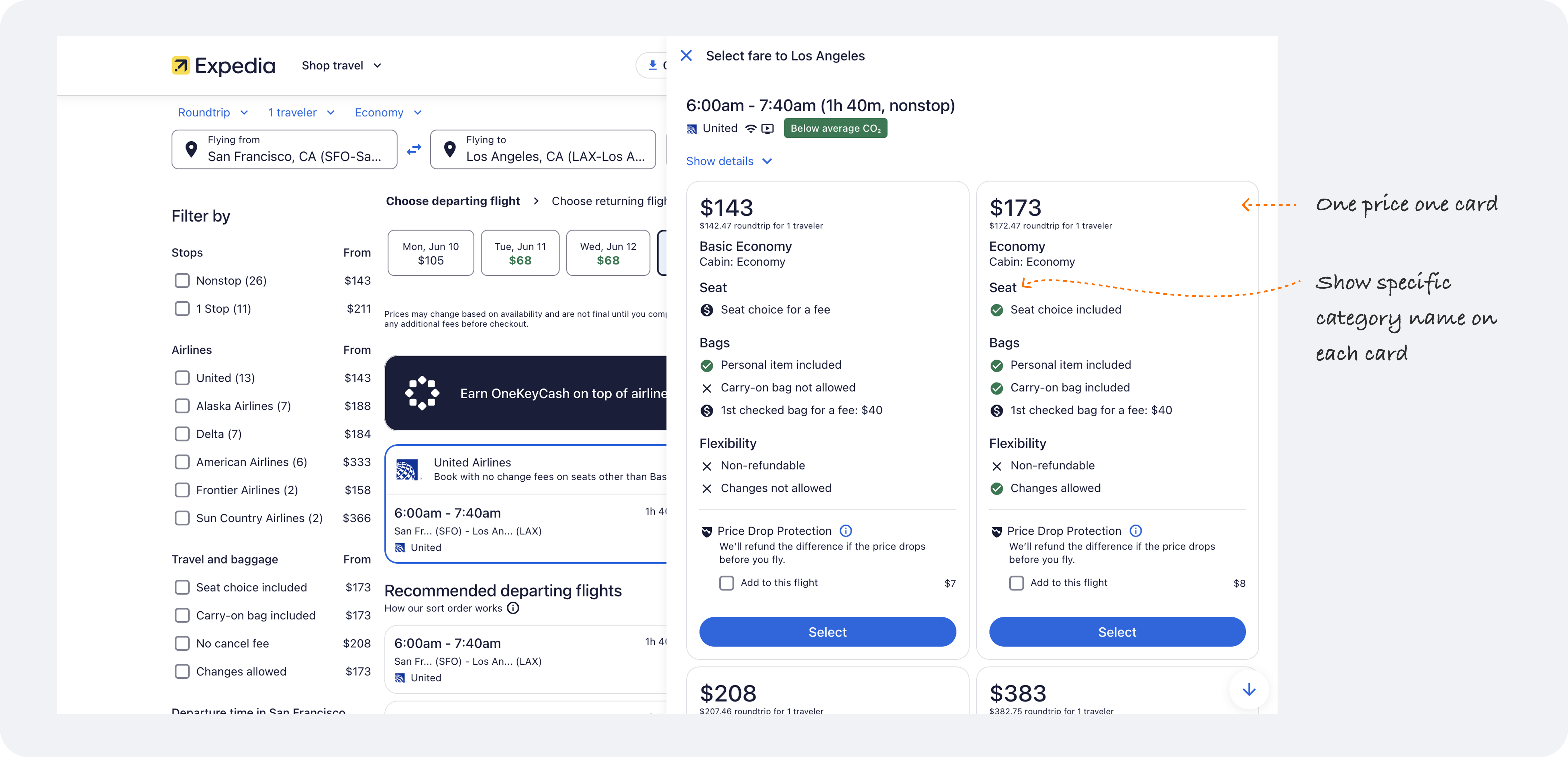
This structure is simpler, allowing the customers to focus on what they care about without additional memorizing or thinking.
Structure Redesign
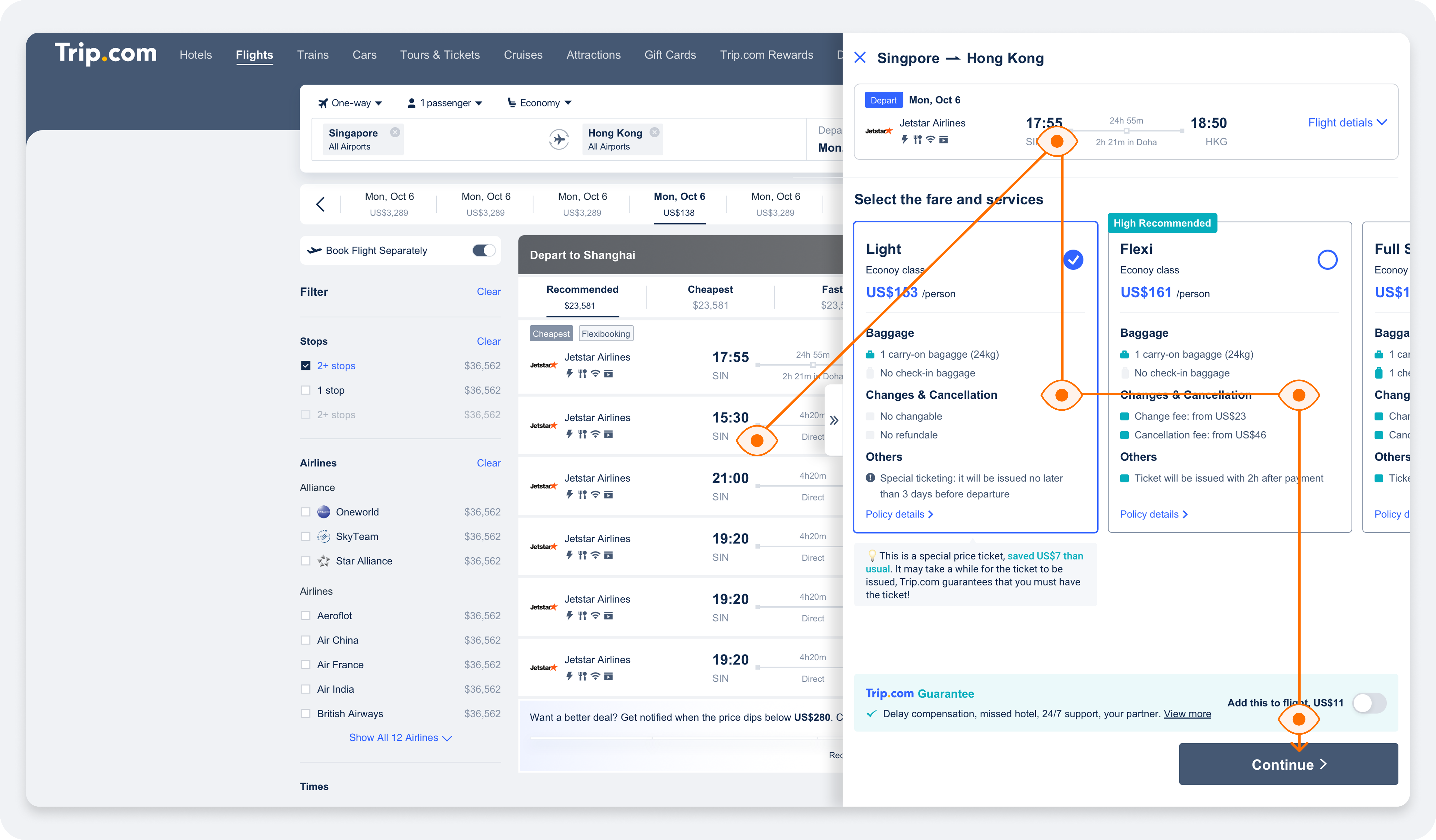
Initially, we considered trying Expedia's structure, using layovers as containers to display prices and presenting the prices in card format. However, this solution has the following issues:
1. The flights on the list page were obscured by layovers, making it difficult for users to compare and choose between multiple flights.
2. The space on the website is too large, requiring users to move their eyes and mouse widely to view the information, making the flight selection process difficult to use.
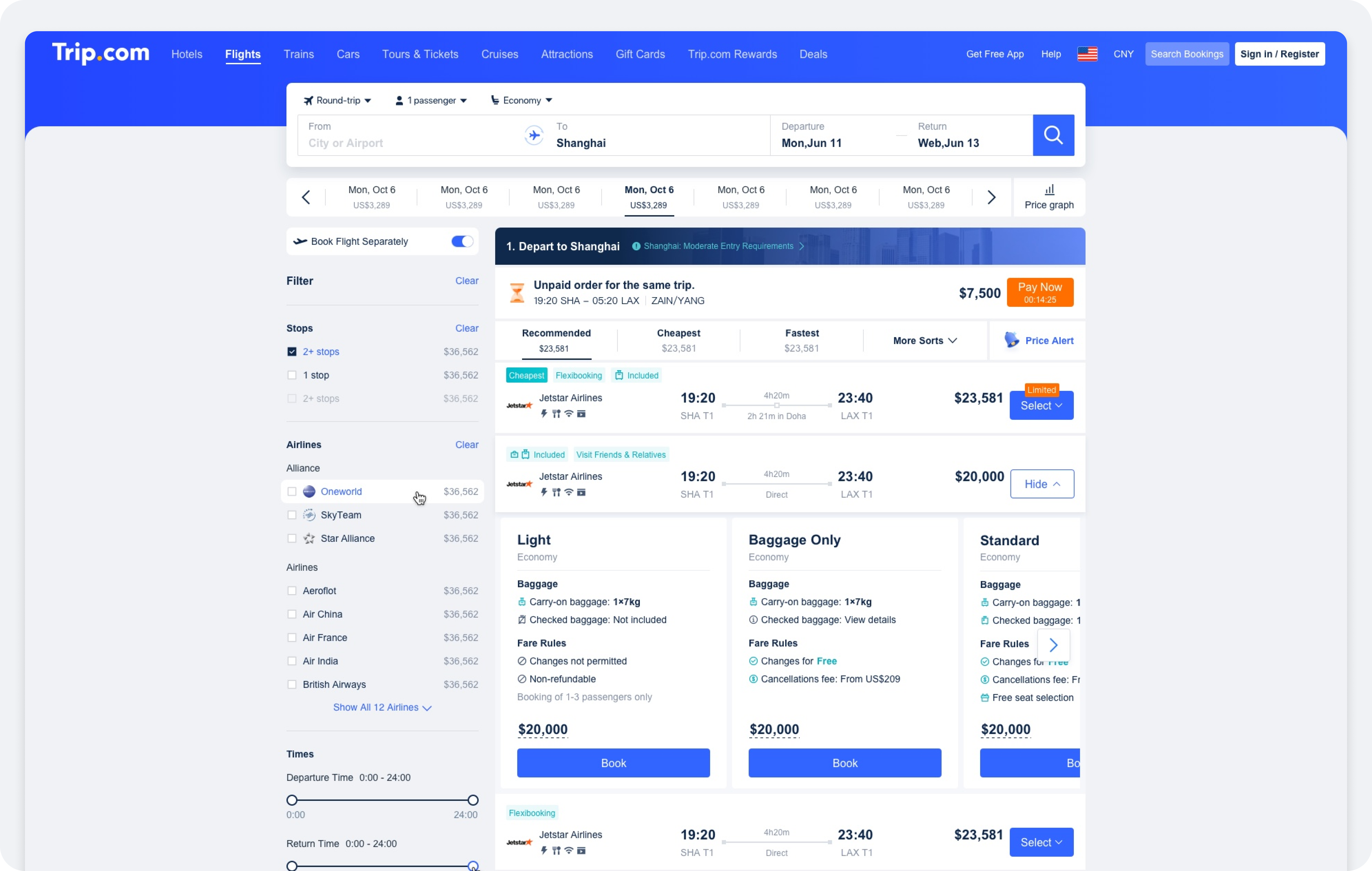
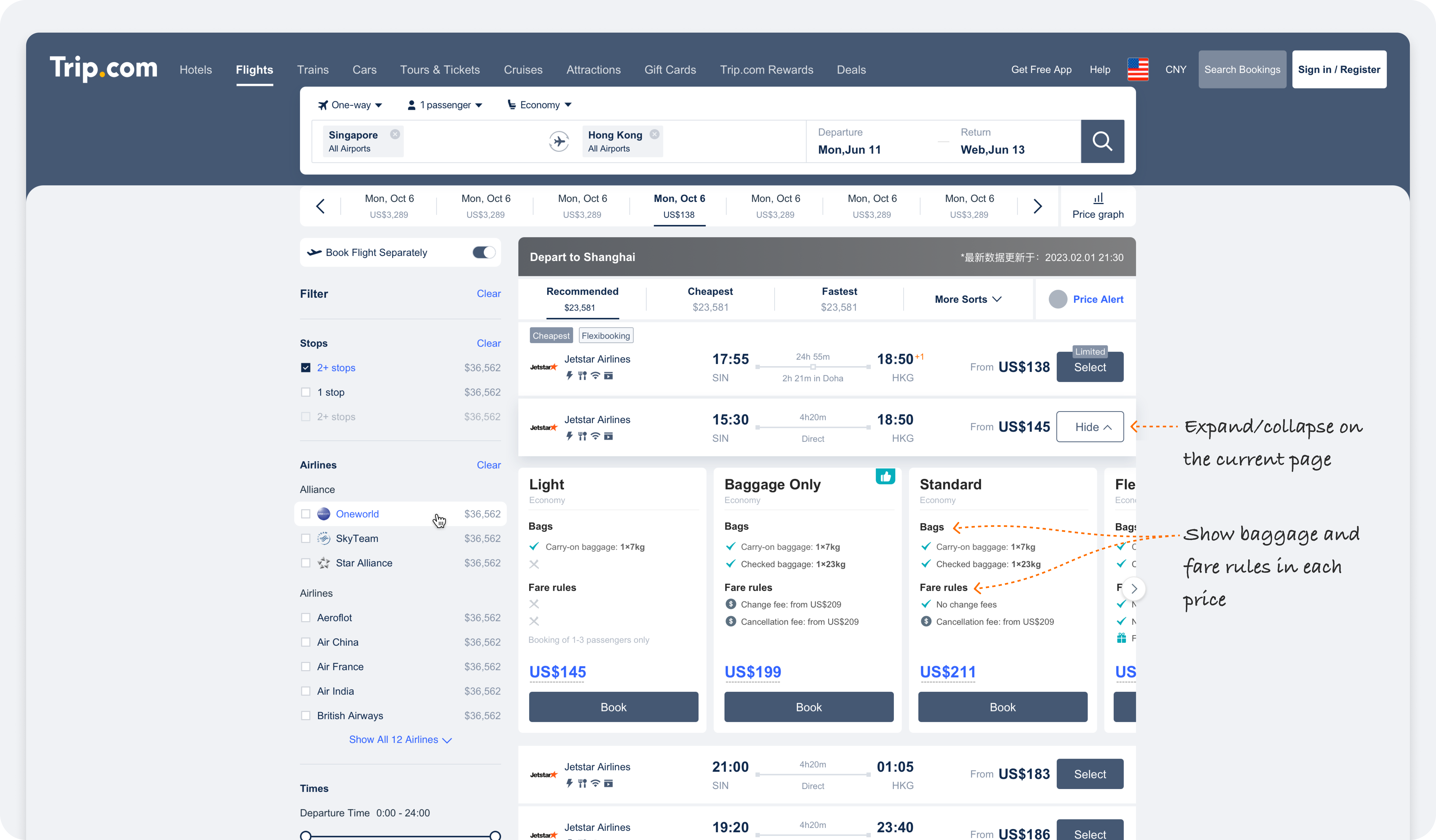
Based on Trip's own user flow, we made the following adjustments:
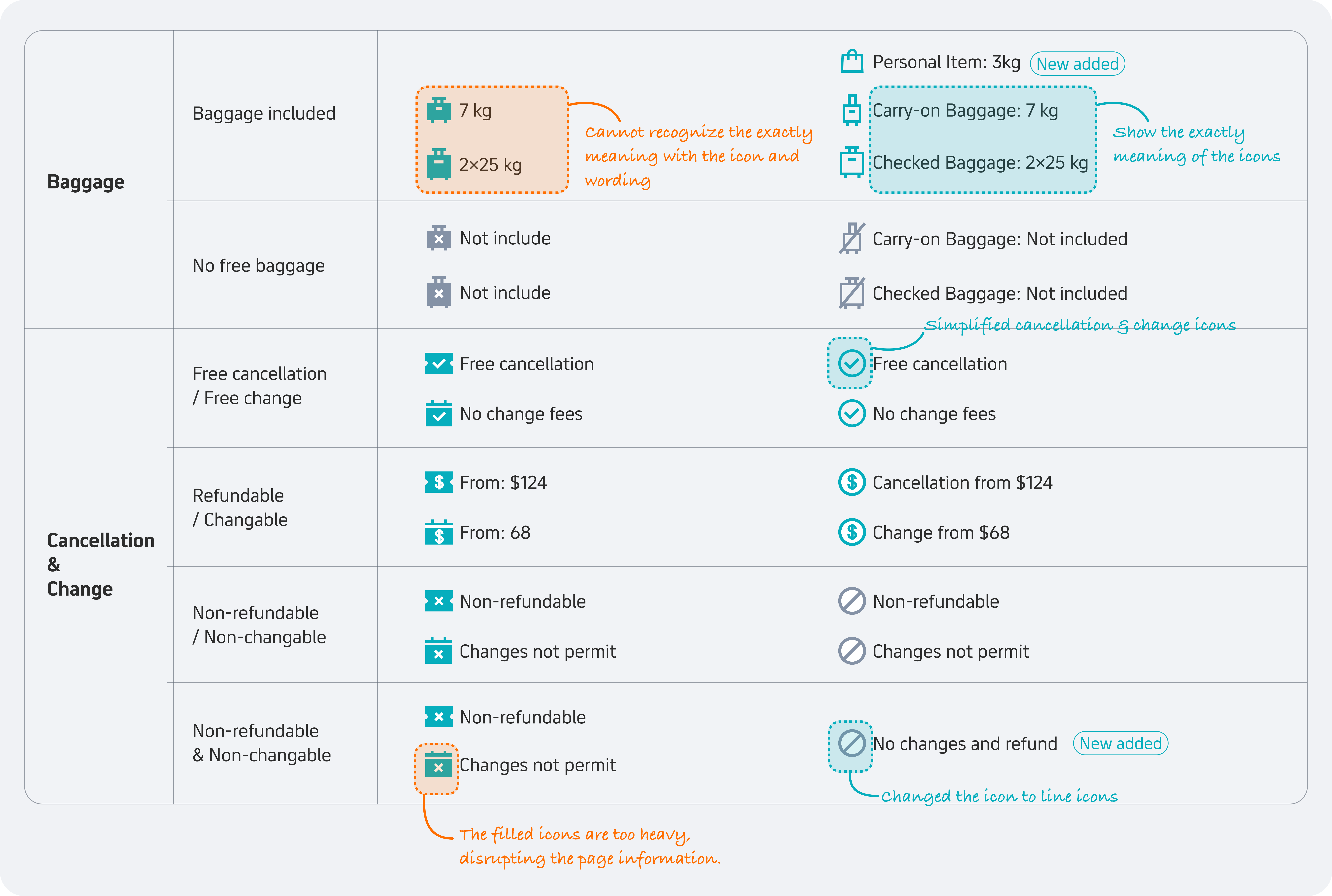
Icon and Wording Redesign
In addition to redesigning the structure, we also adjusted the icons and text for each policy to make them clearer and more intuitive.
Wireframe
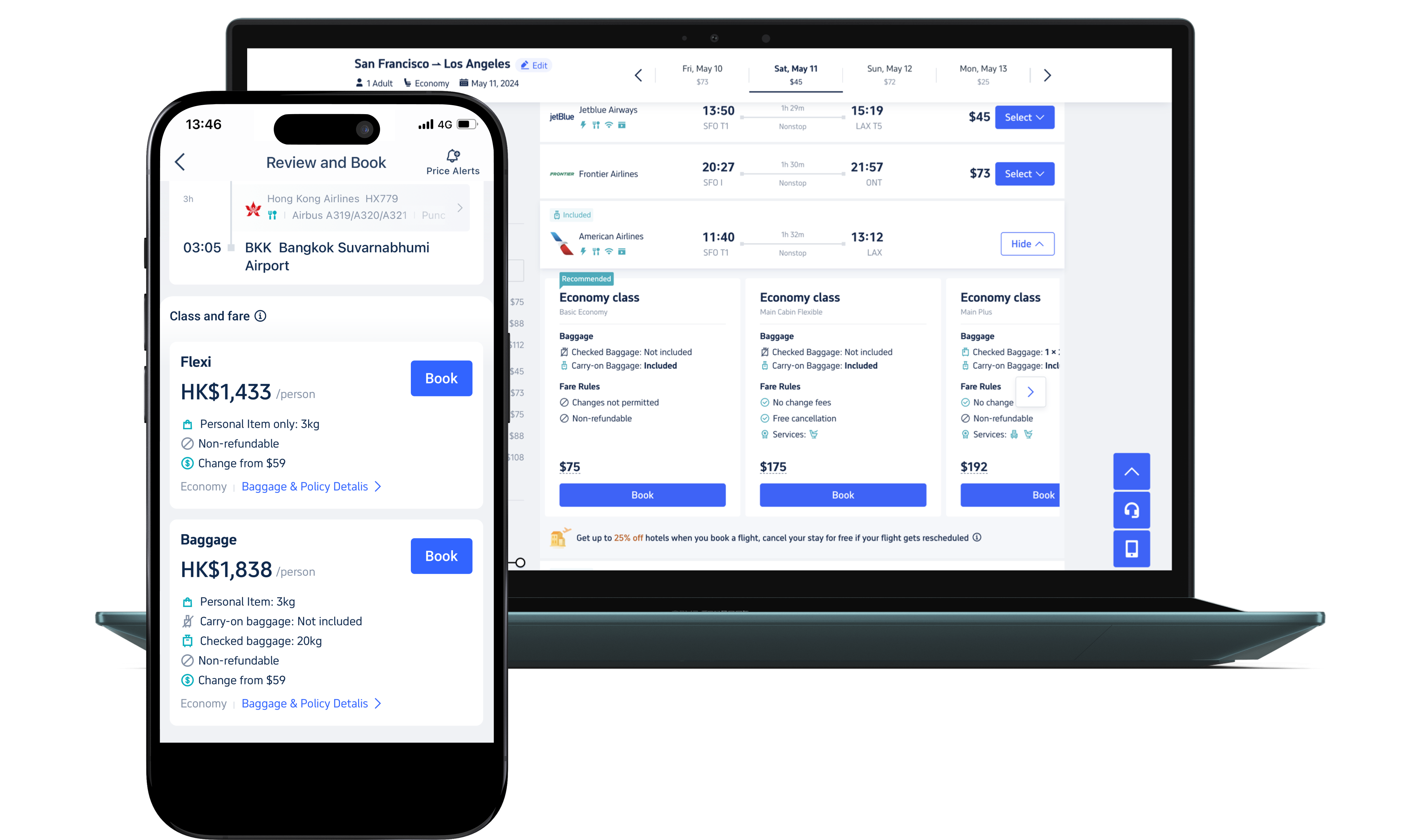
Additional Thinking on The App
Is horizontal comparison also suitable for app? We thought fare comparison on the app unfriendly since users had to compare policies top to bottom across different flight cards. We tried to match the app interaction to the website, but it failed.
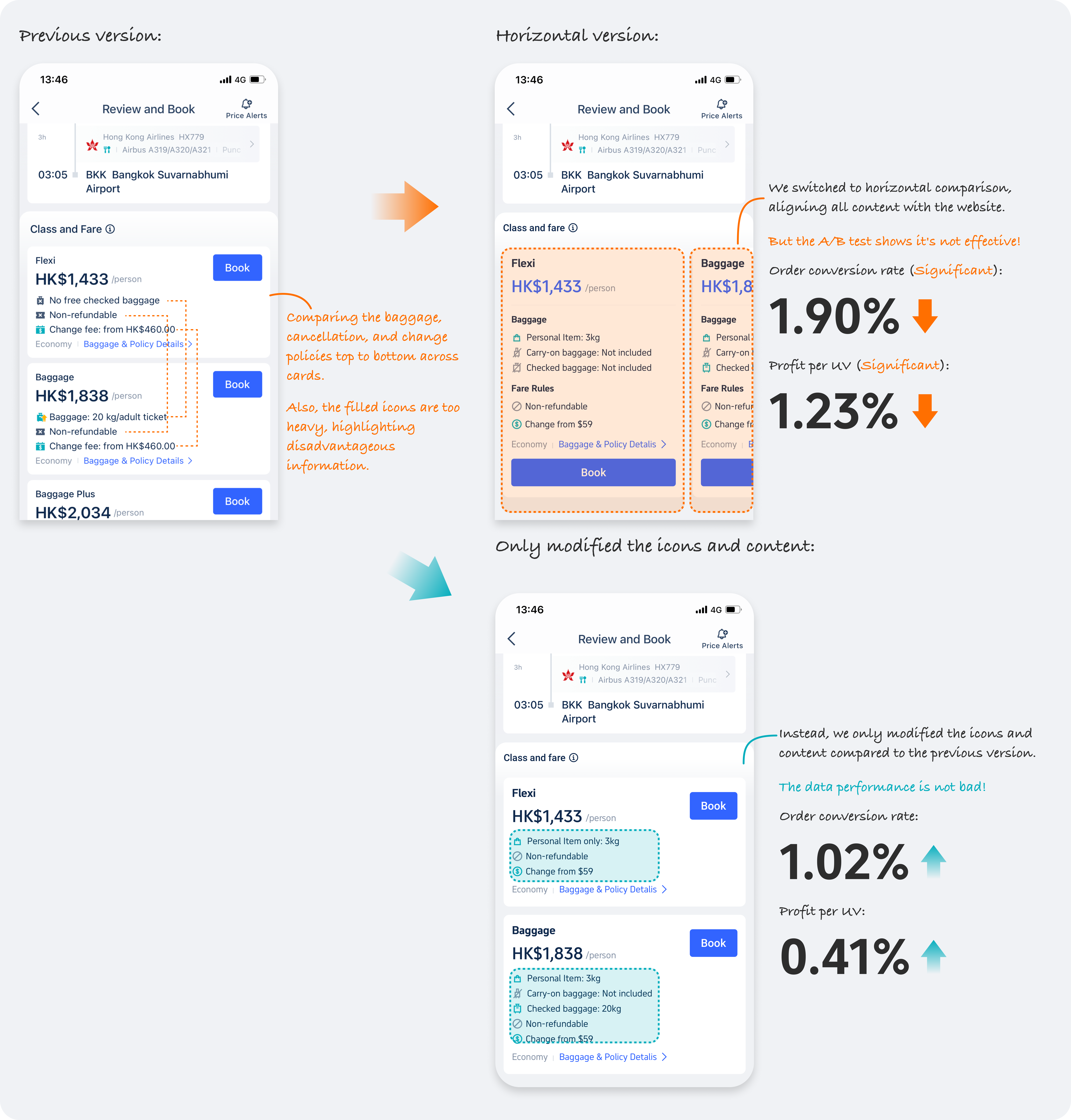
Learning
Due to the different display efficiency between web and mobile, as well as the differing user habits, there are differences in design between the web and app versions, and maintaining consistency blindly is not advisable.