Redesigning Round-trip Flight Booking
 2023 Trip.com Product Innovation
Award
2023 Trip.com Product Innovation
Award
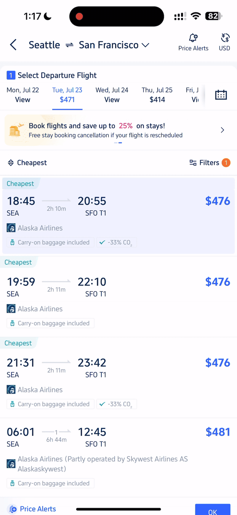
This is the flight selection page of the Trip.com app, and we were exploring interactive methods to reduce the effort required for users to make a selection.
Client
Trip.com mobile app, flight booking process
Time
Aug. 2023
My Role
Creative Direction & Design
Team

Background
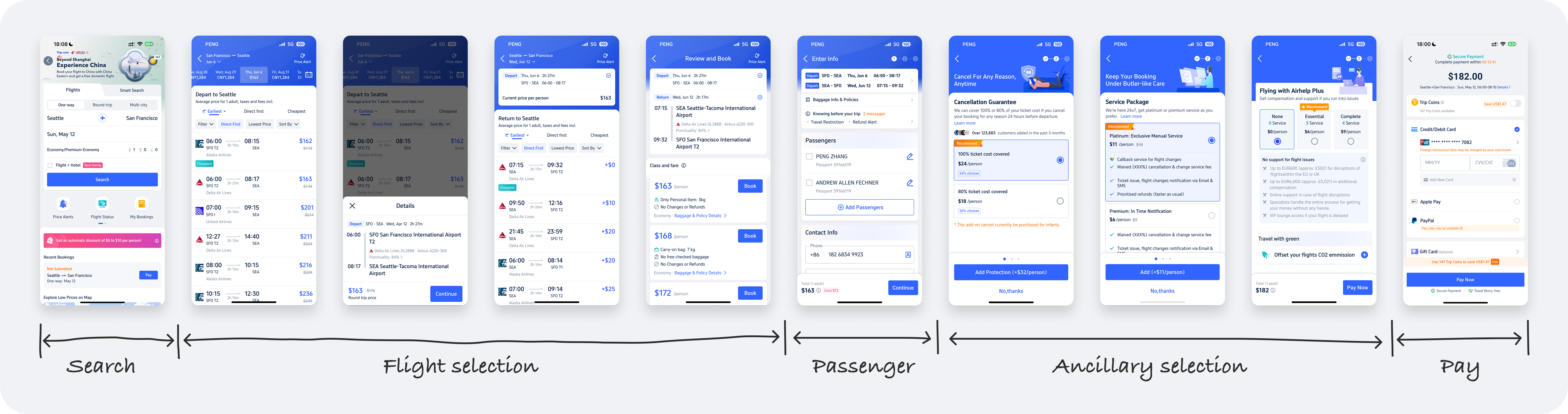
The flight booking process on Trip.com includes "flight selection" and "ancillary product selection" (such as checked baggage, seat selection, etc.). Ancillary products account for 80% of the total order revenue, while the tickets themselves do not generate significant profit. On the other hand, as our business continues to grow, our page processes have also become increasingly complex, as shown in the diagram below. Users need to go through at least 10 pages and steps to complete a flight booking (with the flight selection process taking up 3 pages). This results in a poor user experience and negatively impacts page conversion rates.
Business Goal
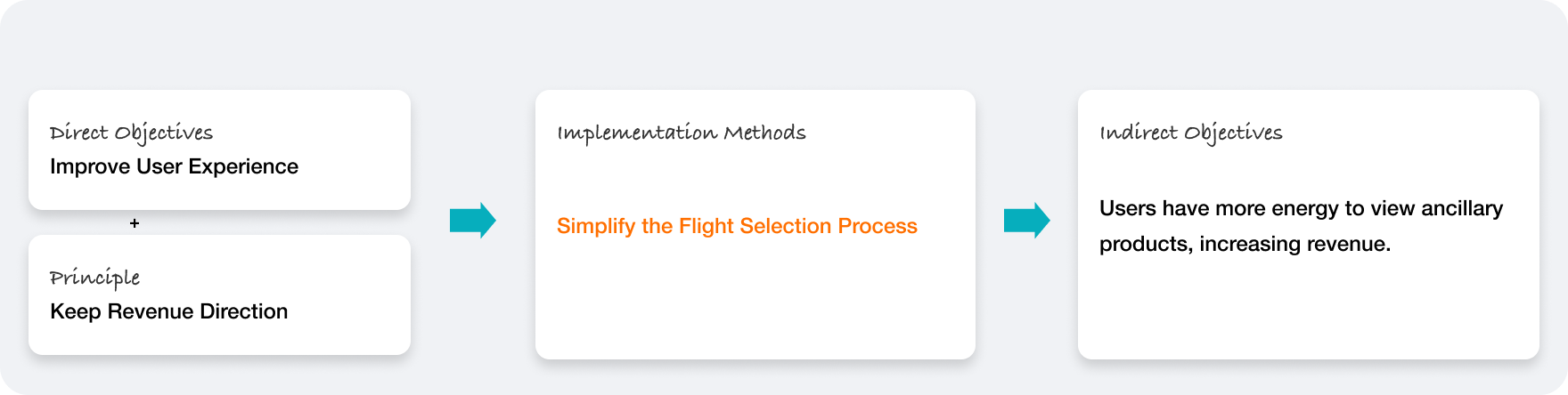
Based on the background and revenue objectives, we aimed to optimize the user experience of the flight selection process. On one hand, this reduced the decision-making cost for users during the flight selection. On the other hand, it allowed users to focus more on selecting ancillary products, thereby indirectly increasing revenue.
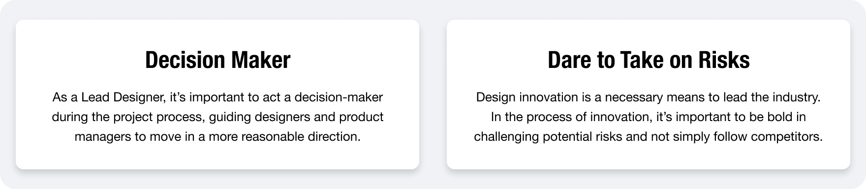
My Impact
As a Product Design Lead, I guided my designers and oversaw the entire design process. The flight booking process was a core workflow, requiring my deep involvement in formulating the design process. This included data analysis, problem analysis, competitive analysis, design decision-making, and resolving difficulties encountered during the design process. Additionally, I communicated with product managers and overseas teams to ensure the design was compatible with multiple markets.
Design Overview
Key Improvements: User Interaction, Information Confirms Flow, Color. (Will intoduce the design process later)
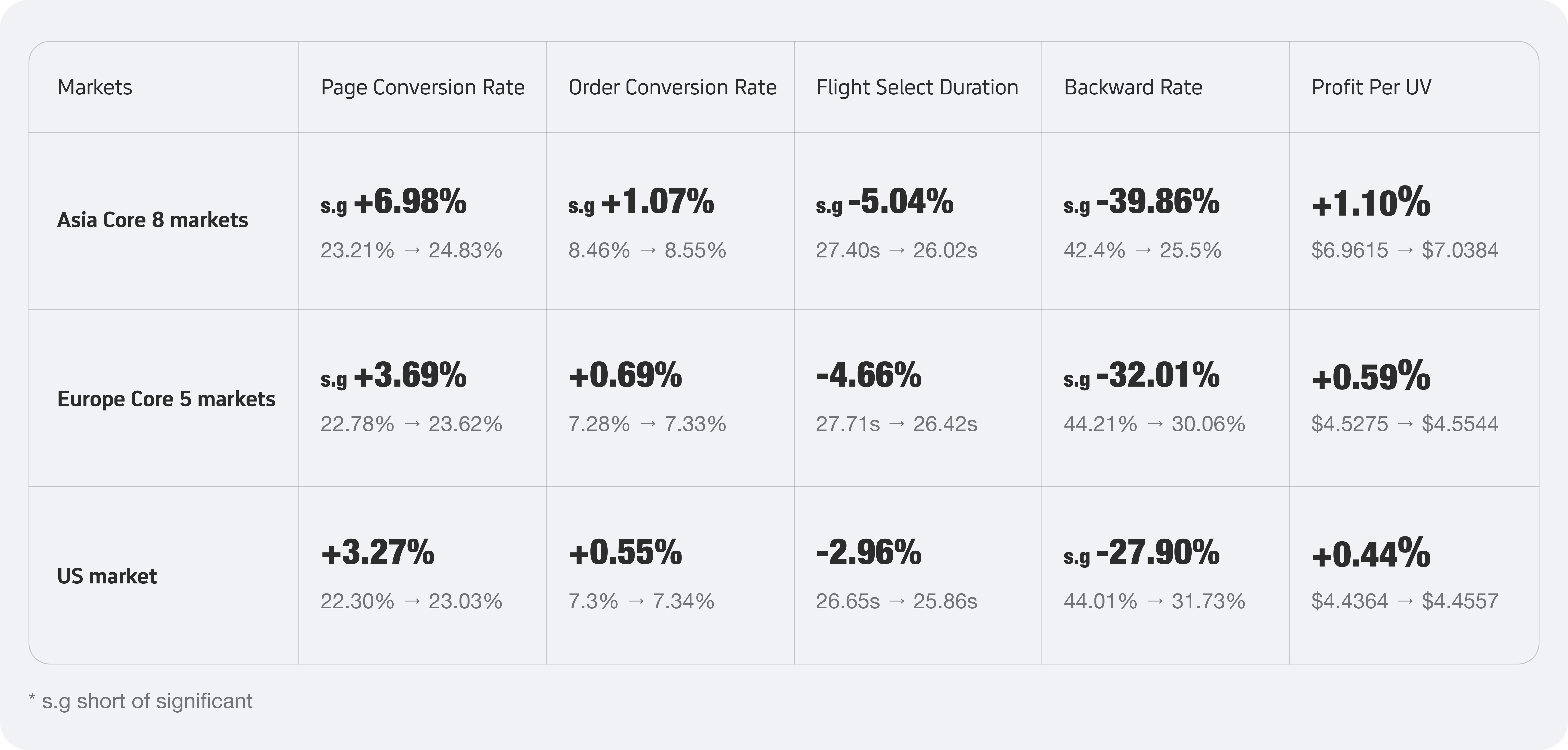
Metrics
The process of selecting flight tickets is a core workflow. To ensure the accuracy of design adjustments, we conducted multiple rounds of A/B testing and evaluated the results using the following data metrics:
Page Conversion Rate (Key metric): Start from departure flight selection page to fare selection page, to validate whether the design adjustments have a positive impact on the conversion between pages.
Order Conversion Rate (Key metric): Start from departure flight selection page to complete payment, to verify whether the design adjustments have a positive impact on order conversion.
Flight Select Duration (Key metric): To verify whether the design adjustments have improved the efficiency of users selecting flight tickets.
Return Page Backward Rate (Key metric): To verify whether the 3/7 split-screen design positively meets the users' needs for selecting and modifying flight ticket options.
Profit Per UV (Reference metric): To verify whether the redesign of the flights selection process has indirectly increased revenue.
Since Trip serves multiple languages and markets and we want to use a single design to cover all core processes across these markets, we need to monitor data across multiple regions. This can be roughly divided into the Asia Core 8 markets (Hong Kong, Korea, Thailand, Japan, Taiwan, Singapore, Malaysia, Australia), Europe Core 5 markets (United Kingdom, France, Spain, Germany, Italy), and the US market.
Metrics
💡 My Impact here: led designer to review data metrics and analyze data weekly in the A/B system, and communicate design detail adjustments promptly with the product manager.
The following is the design process after receiving the requirement
Issues and Data Analysis
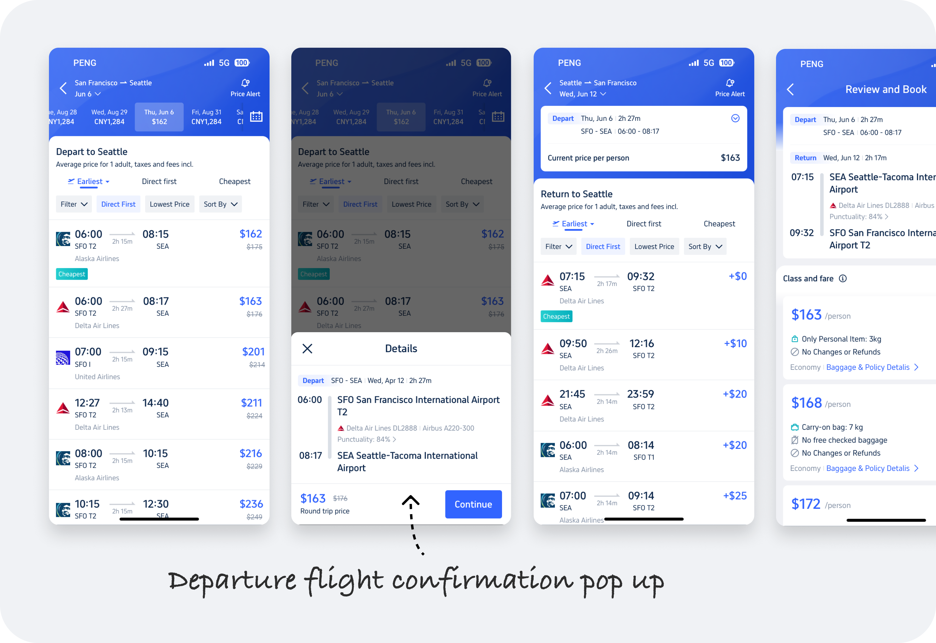
Issue 1: Process Redundancy
As shown in the image on the right, in the round-trip flights selection process, after selecting the departure flight, a flight information confirmation pop-up always appears, which significantly disrupts user behavior. Our data shows that approximately 21% of users click the close button in the upper left corner of the pop-up to reselect the other flights.
🤔 Is it possible to directly remove the pop-up to shorten the process?
After discussing with the product manager, we agreed it was the simplest solution. However, after two weeks of data, we found that while the conversion rate from the departure page to the return page improved, the conversion rate from the return page to the next page dropped significantly by 3.4%, and the order conversion rate decreased by 0.32%. Therefore, we abandoned this idea.
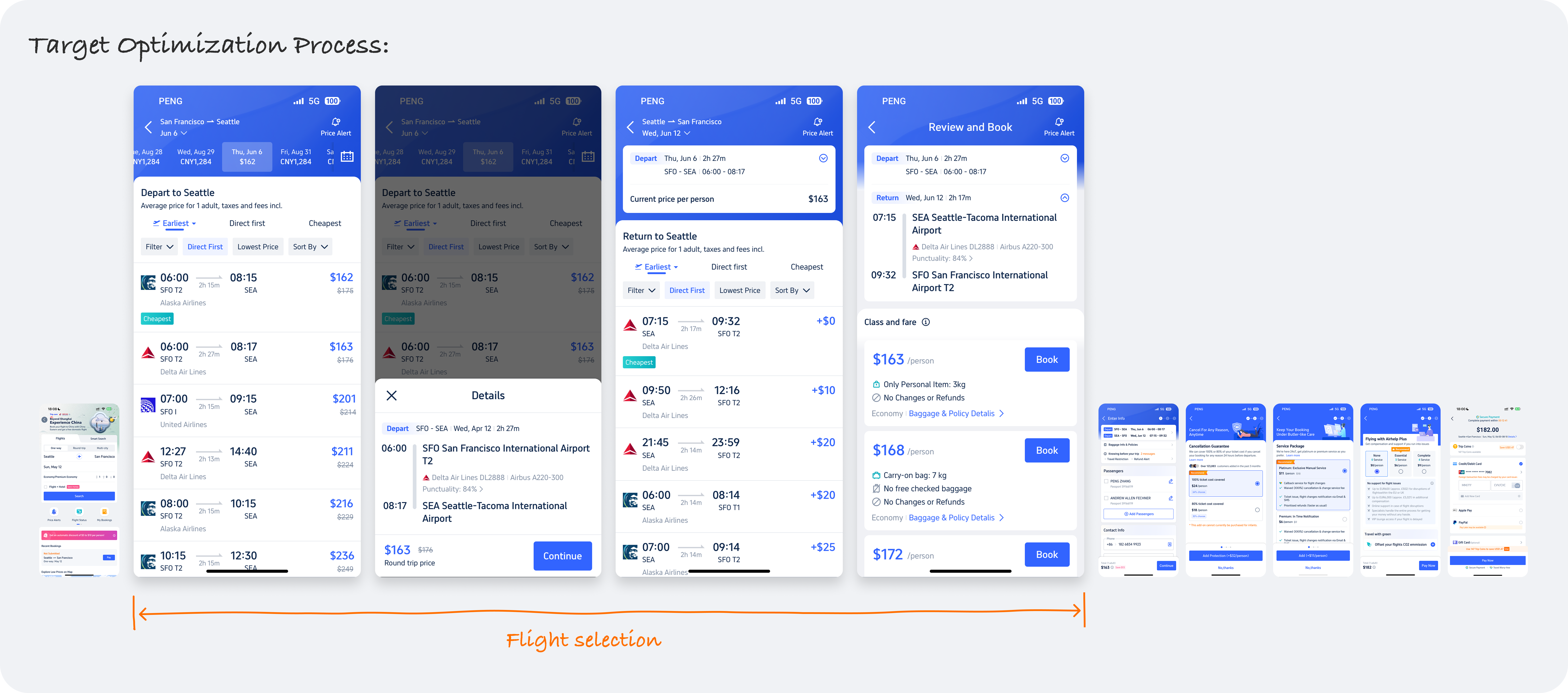
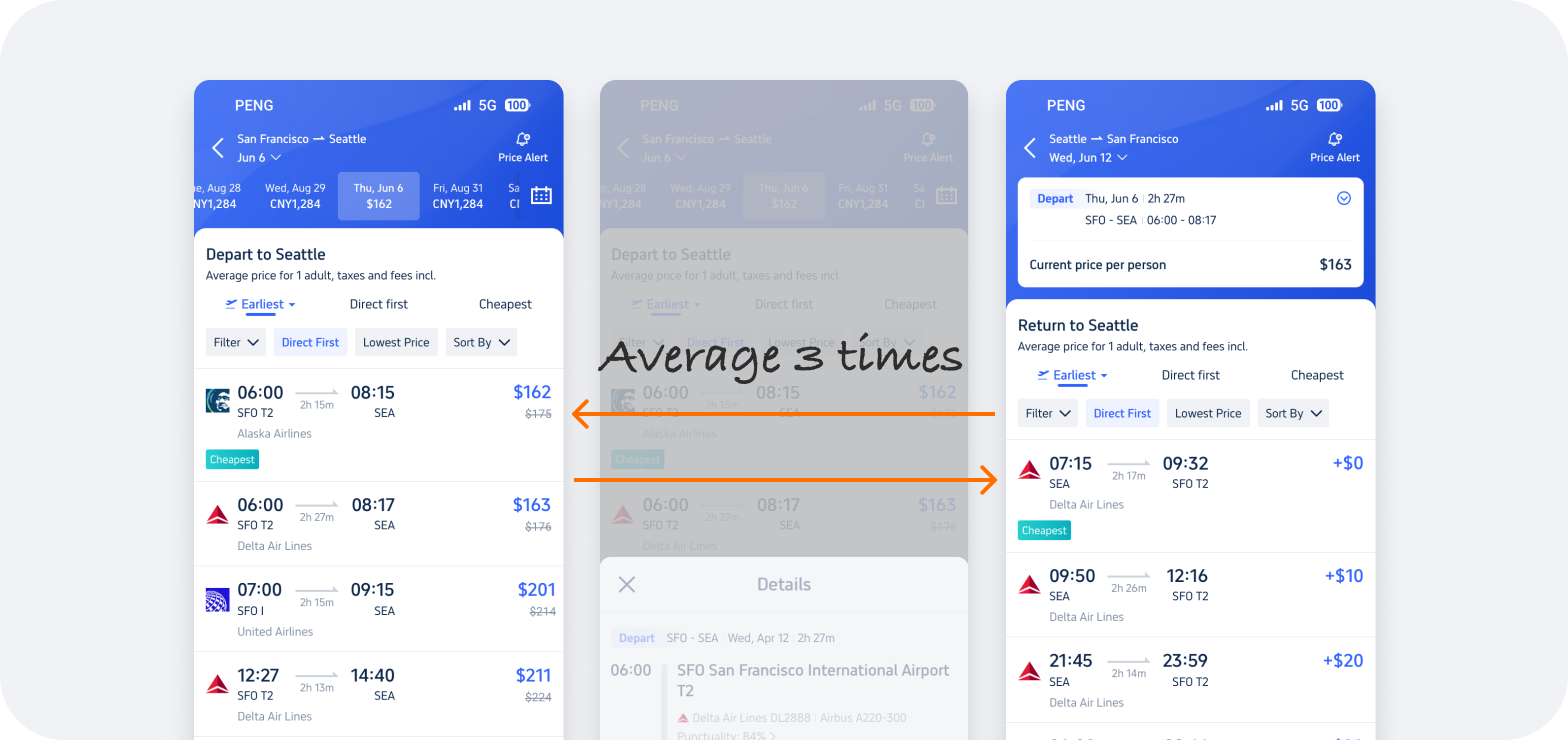
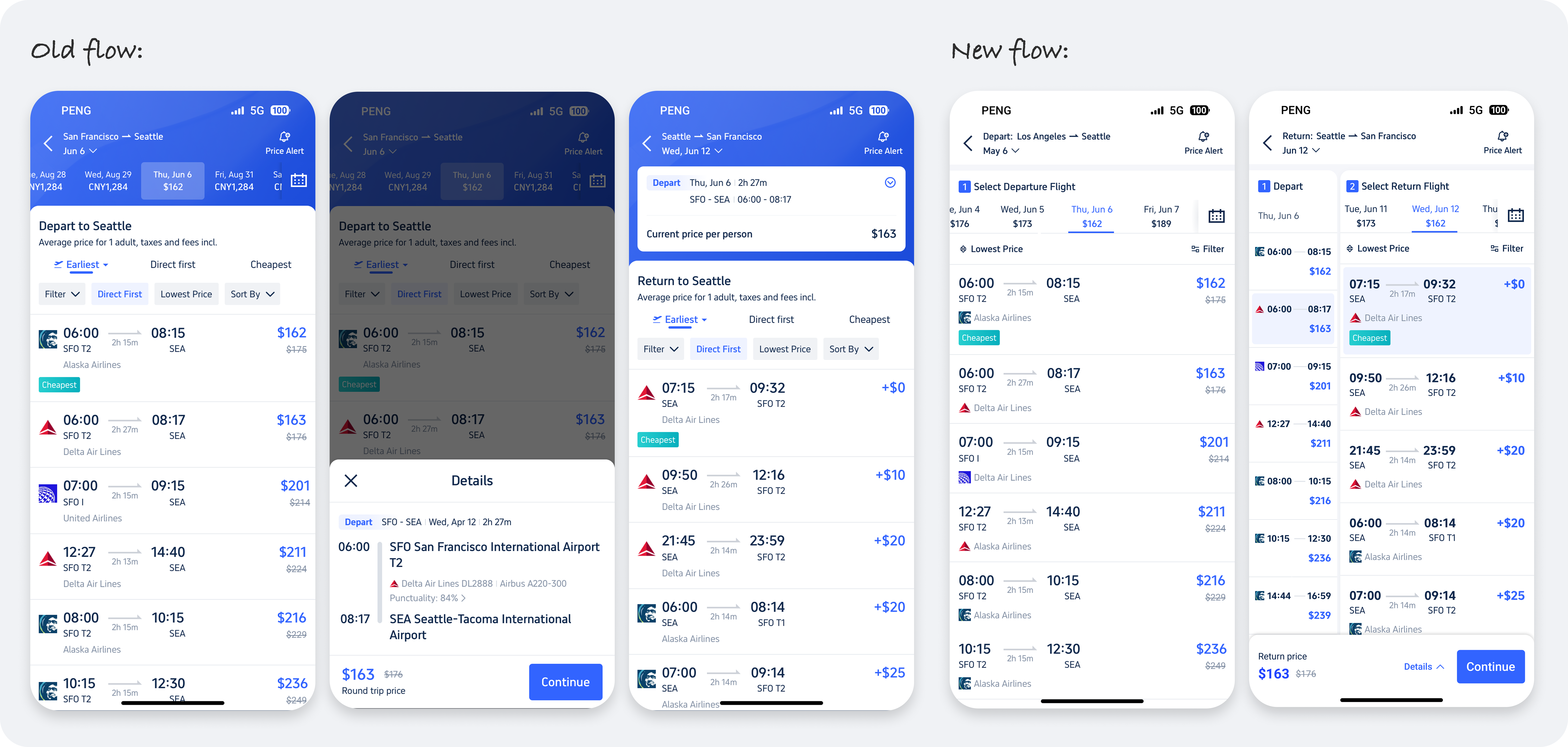
Issue 2: Repeated Page Switching
In the past, we conducted offline user interviews in markets such as Japan, Korea, Thailand, and Europe. We found that testers often switch back and forth between pages to view and compare round-trip flight information and prices during the booking process. Additionally, based on user behavior tracking data tools, we discovered that users average at least three times page switch during a single flight search process. This research and data indicate that selecting departure and return flights on separate pages reduces user selection efficiency and increases the cost of comparing flights.
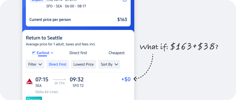
Issue 3: Users Need to Calculate Price Independently
As shown in the right image, although we use addition to inform users of the extra cost for the return flight, it is not a good user experience. Users have to calculate the total price themselves, and not all users are good at math, which adds extra cognitive load. Even though they can check the total price on the next page, this may lead them to return to the previous page if not match their expectation.
Issue 4: Header Color and Functions Are Too Bold
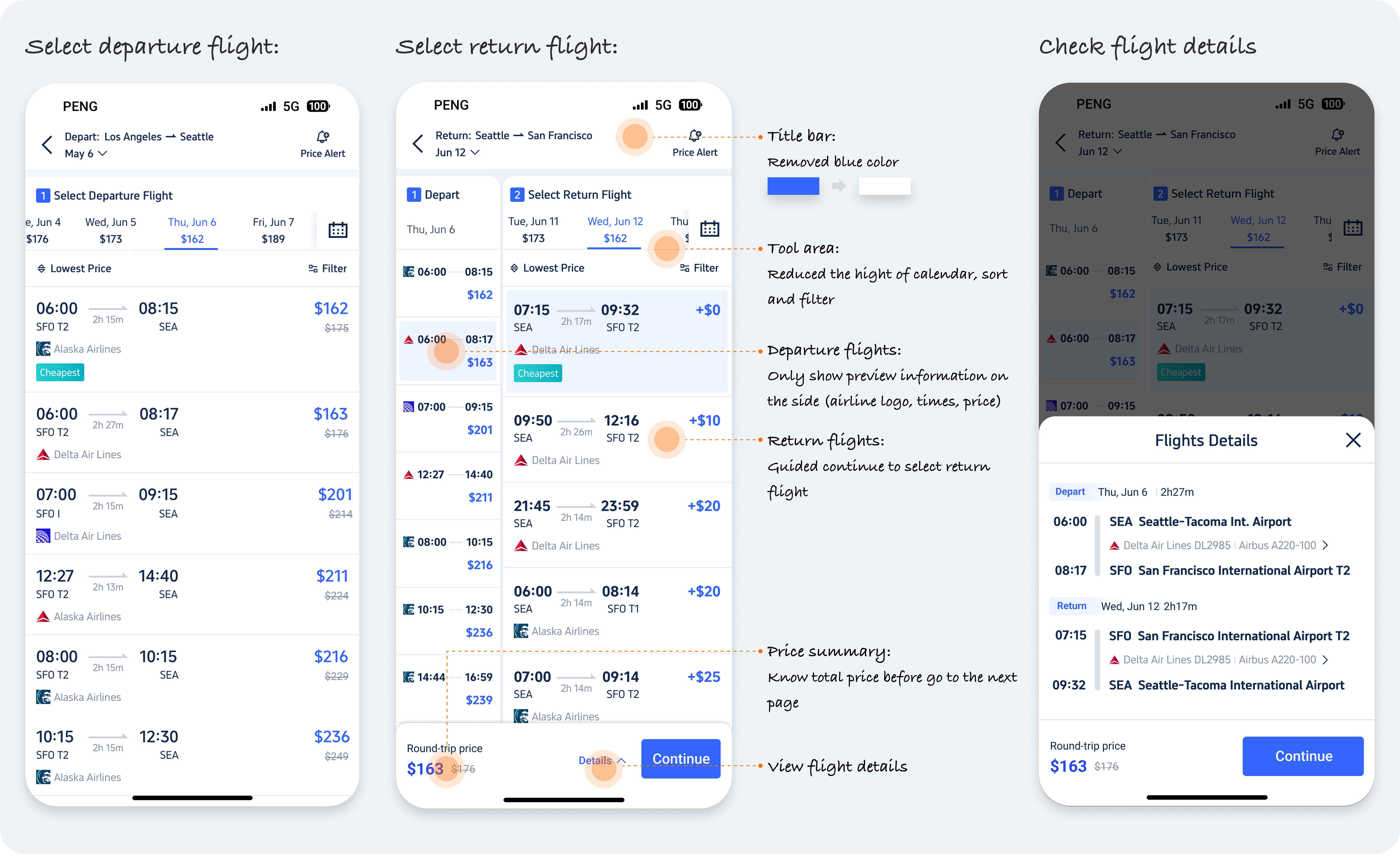
Please see the image below. The header on the flight selection page uses Trip's brand blue. While this contributes to brand identity, the heavy use of blue affects the user's ability to view flight information. Additionally, the header contains information and functions such as the calendar, title, filters, and sorting, occupying 30% of the screen height, which also impacts the efficiency of viewing flight information.
Design Direction
Based on the analysis of the above issues, we have clarified our design direction: to reduce the effort required for users to select round-trip flights and to enhance the priority of displaying flight information. We will refine our design solutions after conducting competitive analysis.
Competitor Analysis
We researched both Chinese and international competitors, including Booking.com, KAYAK, Skyscanner, Expedia, Hopper, Priceline, Kiwi.com, as well as Ctrip (Trip.com’s Chinese version).
Through competitive analysis, we can see that mainstream in western Countries typically involves (1) selecting a combination of departure and return flights, with some, offering (2) separate selections for round-trip flight (Same as Trip.com). The Chinese version of Trip.com (Ctrip) uses a (3) split-screen approach.
However, based on past iteration experiences, we have tried the combination flight selection method, and the performance data varies across different countries and markets. The data for the European markets does show none significant improvement compared to the separate selection model, while the data for the US and Asian markets actually declined.
I also contacted the Design Lead at Skyscanner (which was acquired by Trip and has a connection with us). He informed me that Skyscanner previously used a separate selection model for round-trip tickets. When they designed the combination model, they conducted A/B tests and found no significant difference in the data between the two models. However, Skyscanner wanted to establish a recommendation algorithm to provide user-satisfactory results and streamline the process, and since Europe is their primary market, they decided to retain only the combination model. This approach is somewhat different from Trip’s current strategy, as we aim to offer more flexible options for users, with our primary users being in Asia. Ultimately, we decided to abandon the combination model design.
💡 My Impact here: I provided experience and data from past projects and communicated with Skyscanner (cross-functional cooperation) to guide the design direction.
Design Derivation
The following is the process of refining and finalizing the design solution:
Concept 1: Half - Half
Our initial idea was to split the screen in half, displaying the departure flight list on the left side and the return flight list on the right side. This way, users could avoid switching between two pages and could flexibly combine departure and return flights. However, as shown in the image below, we encountered issues with multilingual languages. While the English layout had no significant problems, switching to Vietnamese resulted in overlapping price and labels. We did attempt to adjust the font size and position of the prices, but this did not effectively resolve the multilingual issue. Due to the poor flexibility and scalability of this solution, we decided to eliminate it.
Concept 2: 7/3 - 3/7
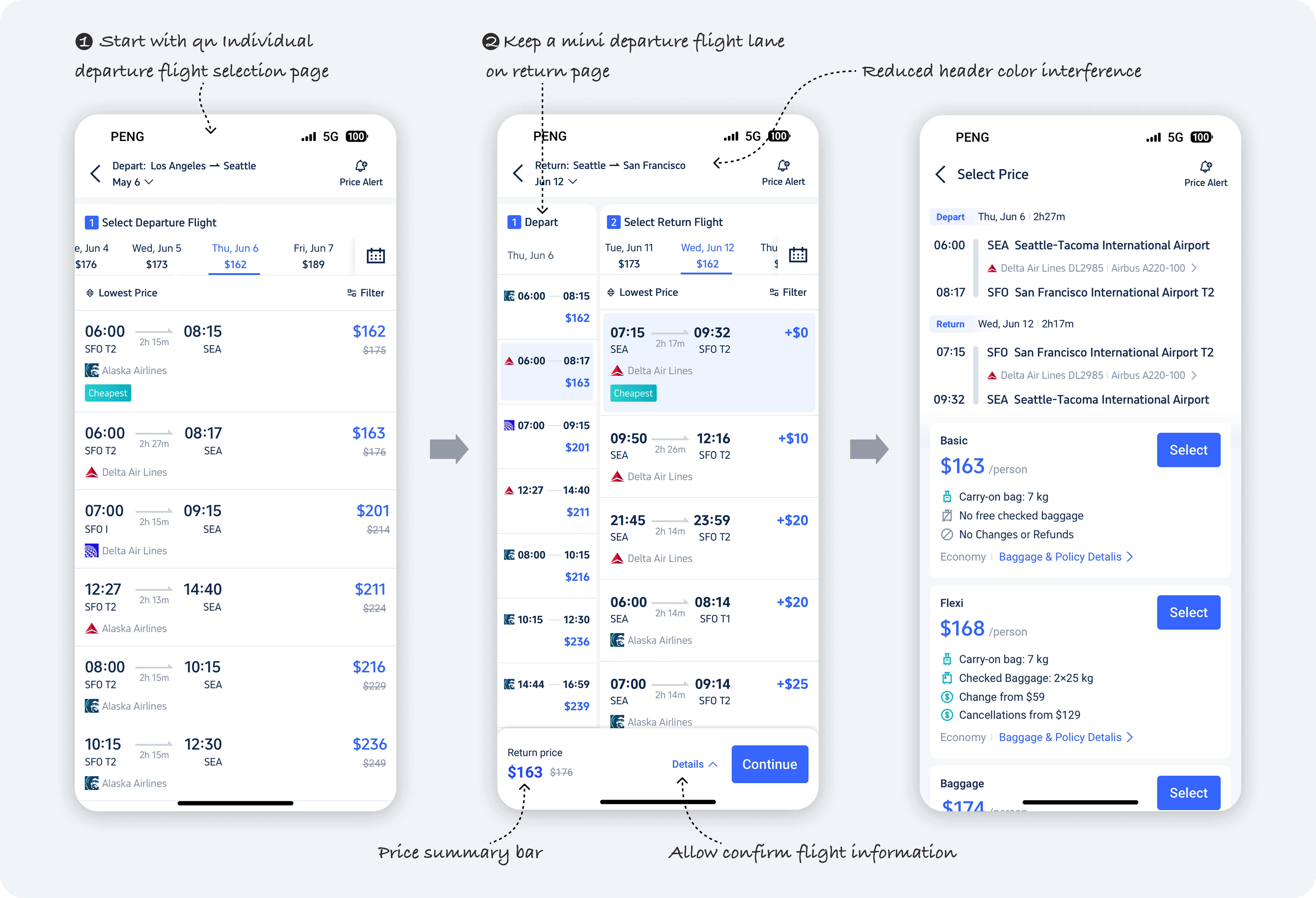
This is the design used by Ctrip, where both departure and return flights are displayed on the same page, also addressing the issue of users having to switch between two pages. Unlike Concept 1, we can ensure that this solution supports multiple languages. However, this design introduces a more complex interaction switching logic, which we are concerned overseas users might find difficult to understand. Therefore, we kept this design and conducted a usability test alongside Concept 3.
Concept 3: 1 - 3/7
To ensure page stability and ease of use, we still use a separate page to select the departure flight, and with a transition animation to switch to the return flight selection. The difference is that on the return flight page, users can simultaneously modify the departure flight and select the return flight. This solution effectively addresses the issue of navigating back between pages.
Usability Testing
Wireframe
Final Performance
Data Performance

Challenges
The Project Itself
In this project, we made multiple hypotheses and validations. As the Design Lead, I guided the designer and communicate with the Product Manager team in a timely manner to ensure that the design process was not delayed. Additionally, during the competitive analysis phase, I effectively communicated with the Design Lead of Skyscanner across companies. By integrating Trip's own business attributes, we avoided retracing our steps.
This project further strengthened my cross-functional collaboration skills.
Report to Higher Managers
Our design solution differed significantly from our competitors, which presented some challenges when reporting to higher managers. We needed to clarify why we didn't follow the same approach as our competitors, what the differences were, and where our advantages lay. However, by presenting our iterative data and past experience, we convinced the higher managers and achieved strong results.
Feedback and Learning
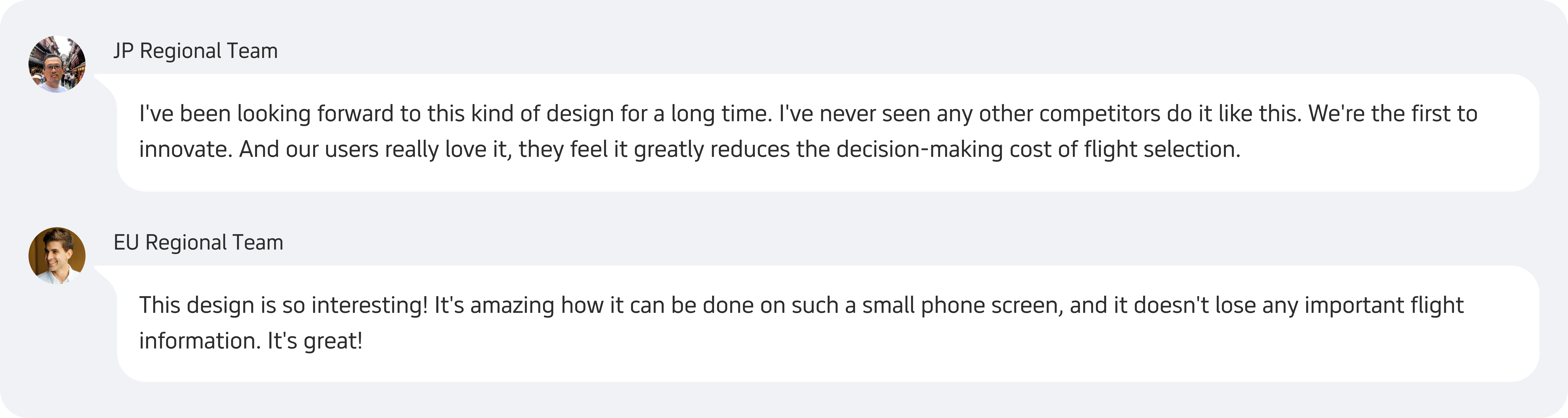
Feedback
After the project launch, on one hand, we followed up on the data through A/B testing to ensure the accuracy of the design direction. On the other hand, we received positive feedback from the Overseas Teams.